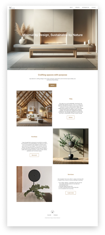
minimal by design,
sustainable by nature
design portfolio
This presentation will introduce a minimalistic portfolio showcase website, emphasizing its visual appeal and alignment with the designer's unique style. The primary goals are to present previous works effectively and provide a clear means for potential clients to get in touch.
design solution
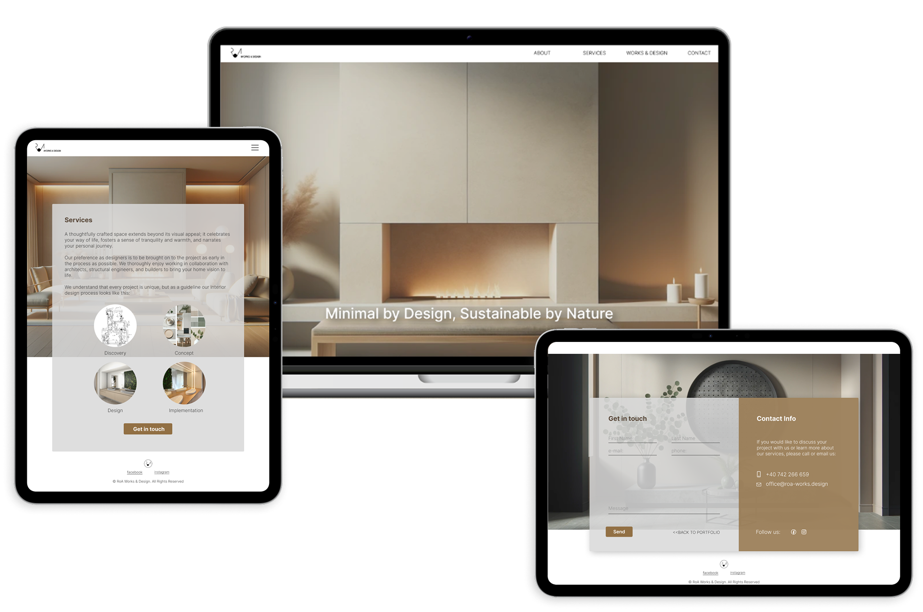
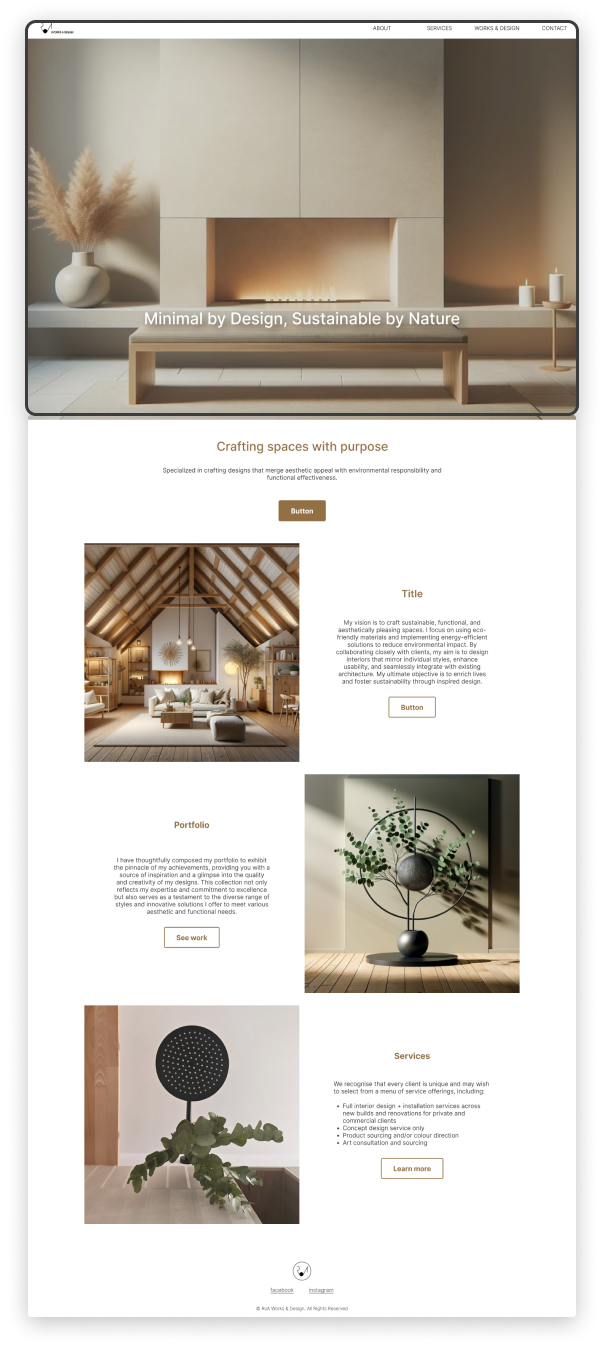
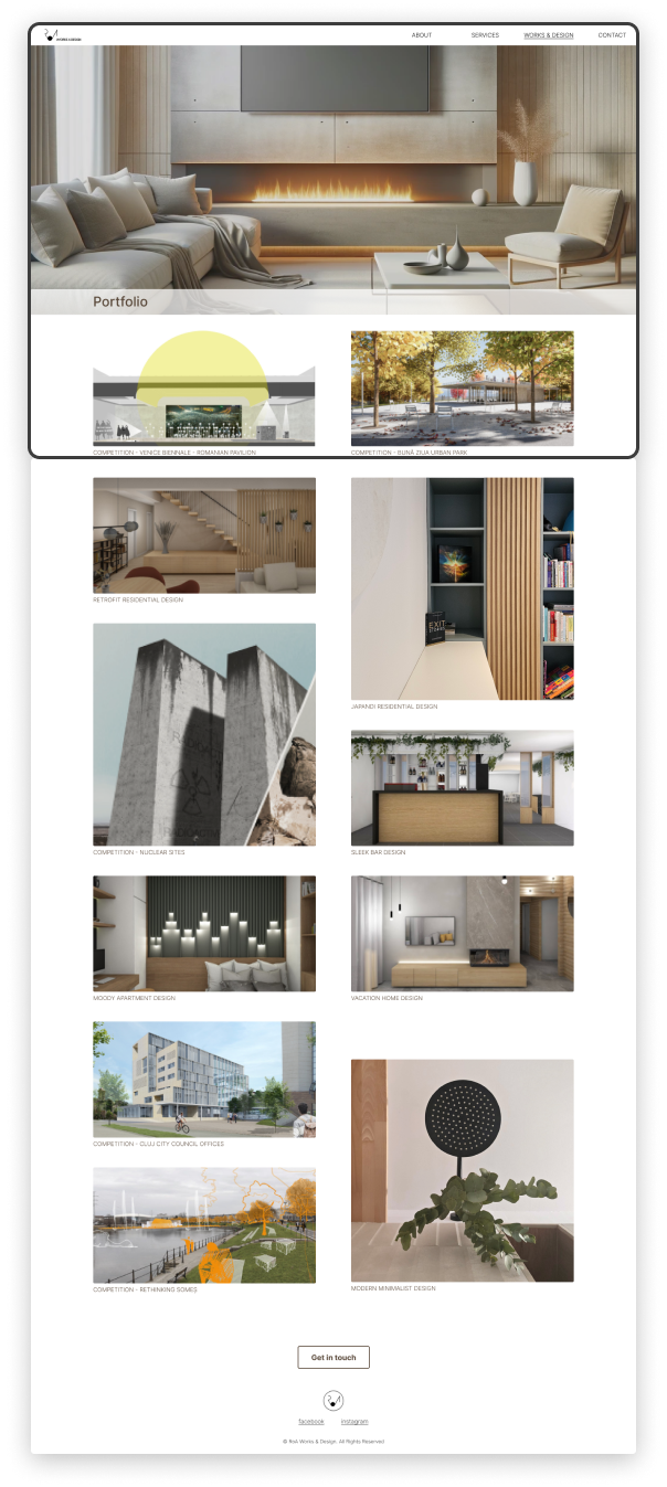
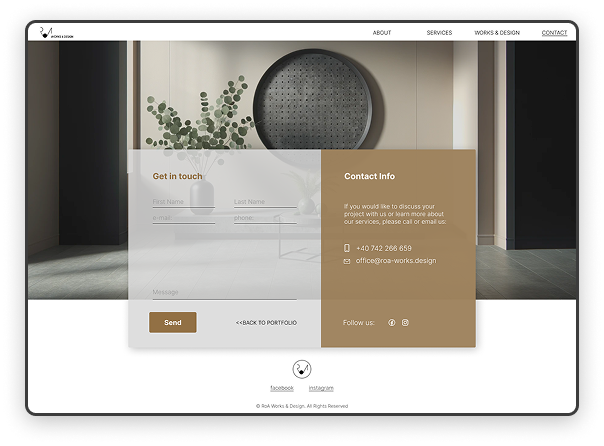
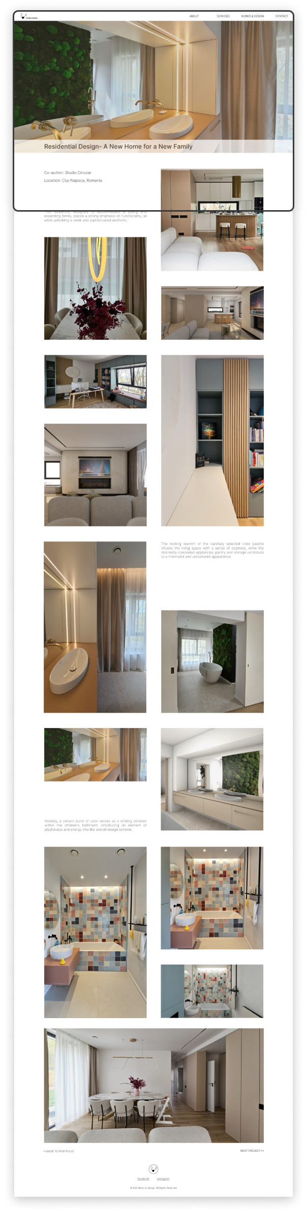
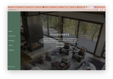
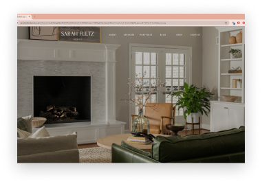
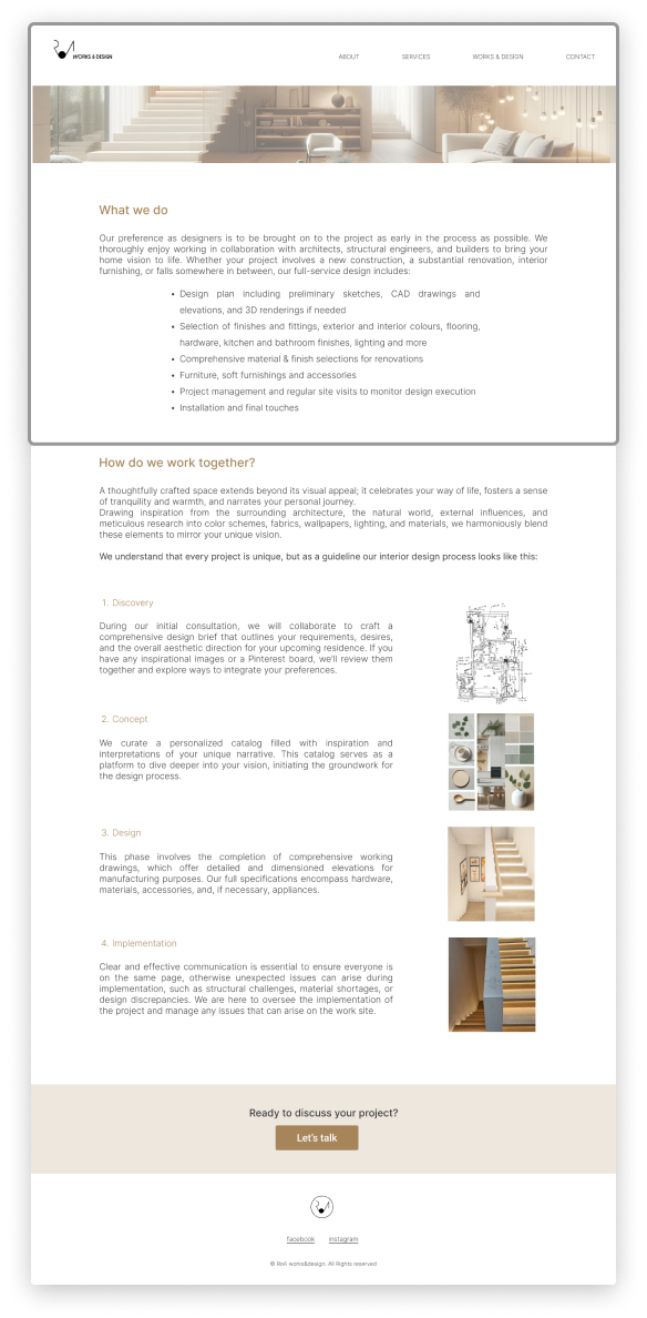
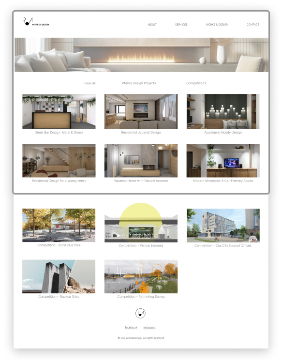
The redesign resulted in a portfolio website that perfectly aligned with the designer's motto. It featured a streamlined, minimalistic design with intuitive navigation and clearly presented project showcases. Sustainable design elements were more prominently highlighted, resonating with clients who value eco-friendly design practices. This iterative process of prototyping, testing, and redesigning ensured that the final website not only looked aesthetically pleasing but also attracted the right clients by effectively communicating the designer's unique approach.
process
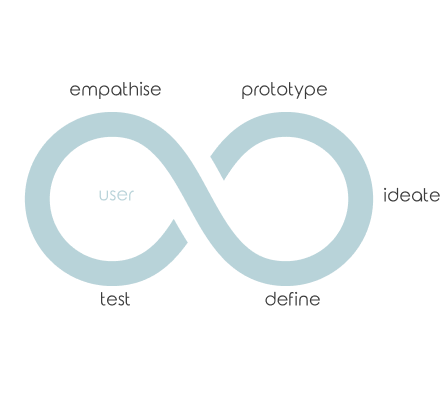
human centered design thinking
The design process for creating an interior design portfolio follows the design thinking methodology, focusing on user-centered design and iterative development. It begins with empathizing, where we engaged with potential users and clients to understand their needs and preferences.
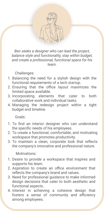
problem statement:
The challenge was to create a portfolio website that would attract clients who appreciate the designer's style, encapsulated in the motto "minimal by design, sustainable by nature." The goal was to effectively communicate this philosophy and showcase the designer's work to appeal to the right audience.
research
I began by researching competitor websites to understand market trends and identify what worked well in appealing to similar client demographics. This analysis helped me pinpoint gaps and opportunities for differentiation.
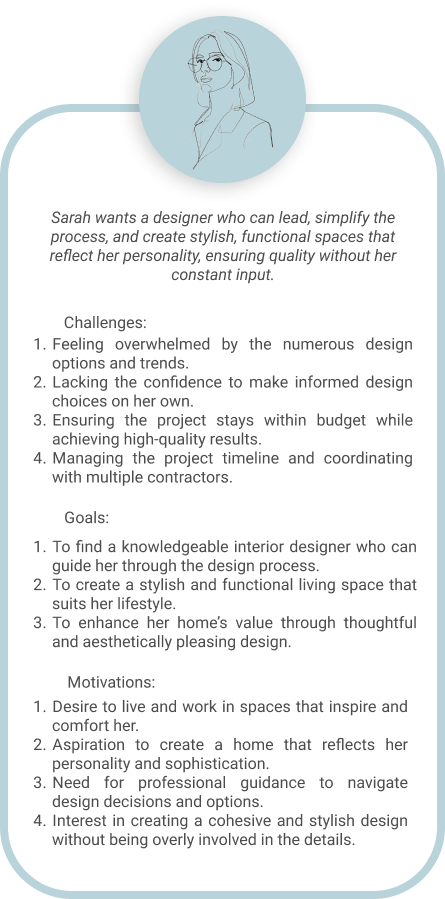
user personas
Next, by creating user personas to represent the target audience we ensured the portfolio would meet their specific needs. In the ideate phase, we brainstormed various design solutions, exploring different aesthetics and functionalities. We then developed prototypes, turning our ideas into tangible representations of the portfolio website.
design iterations &
creative brainstorming
Using the insights gathered in the research phase, we moved into the ideation phase, brainstorming various design solutions that would embody the designer's motto. The focus was on creating a minimalistic layout that showcased projects prominently while maintaining an eco-friendly theme. Wireframes were developed to structure the content logically, and prototypes were built to visualize the design and gather user feedback.


testing & redesign
competitive analysis
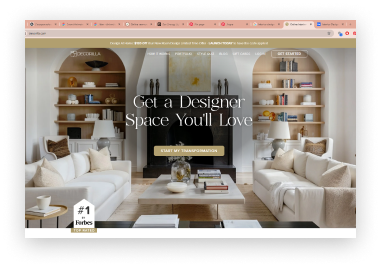
After initial research and iterations, I created a prototype portfolio page that seemed to embody the minimalist and sustainable aesthetic. This first iteration focused on clean layouts and simple navigation to highlight the designer's projects. After developing this initial prototype, we moved into the testing phase, gathering feedback from potential users and clients.
user interviews
User feedback revealed that while the design was visually appealing, certain elements did not fully convey the designer's philosophy or functionality needed improvement. Based on this feedback, we undertook a total redesign of the site. This involved rethinking the layout, enhancing the user interface, and better integrating sustainable design elements into the visual and content structure.
style guide
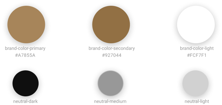
Based on the feedback from the initial prototype, I refined the style guide to create a more visible yet stylish design, maintaining the desired minimalist and sustainable aesthetic. The updated style guide incorporates clean layouts and intuitive navigation. Key elements include a responsive grid system for different devices, a cohesive color palette that balances earthy tones with neutral shades, and a well-defined typography hierarchy using the Inter font family.
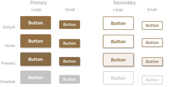
Button styles and interactive elements have been enhanced for better user engagement, while spacing and layout adjustments ensure a harmonious and visually appealing interface. This refined style guide successfully integrates the designer's philosophy into a functional and aesthetically pleasing user experience.
grid styles & spacing

colors
buttons
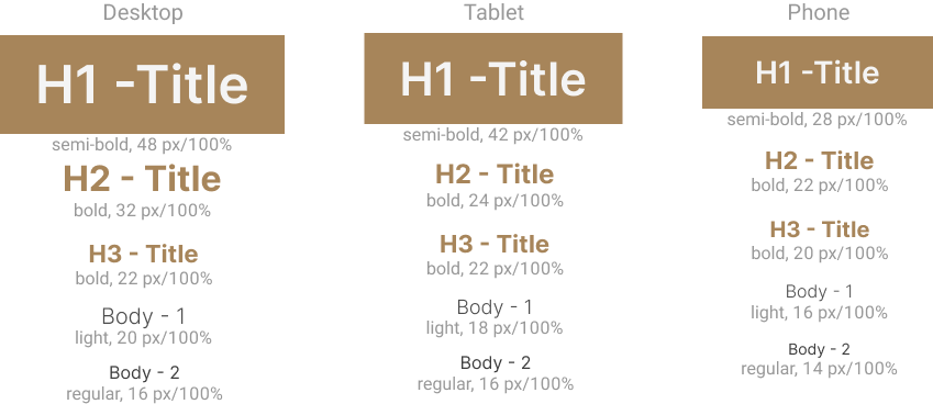
typography
components & responsive design
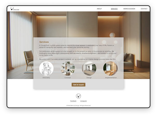
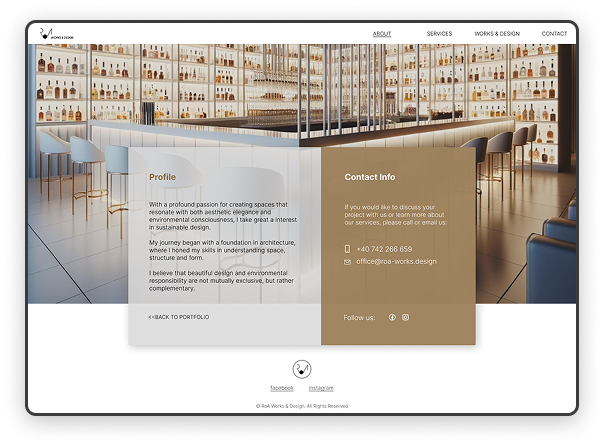
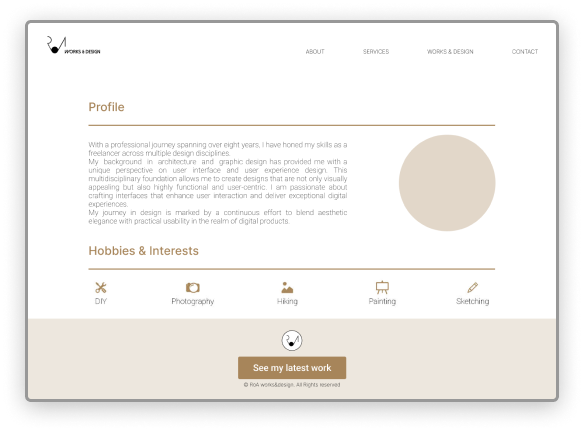
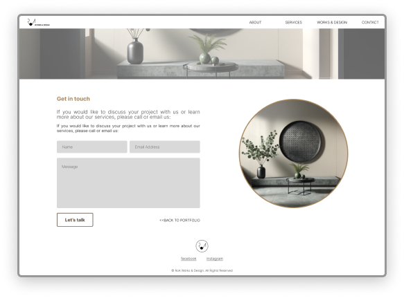
To enhance the user interface and ensure a cohesive, responsive design, I developed a series of cards for the website. These cards were created with a focus on both desktop/tablet and mobile experiences, reflecting the minimalist and sustainable aesthetic.
The horizontally oriented cards are designed for desktop and tablet views, maintaining a clean and structured layout that highlights essential information effectively. These cards feature distinct sections for profile, contact info, services, and call-to-action elements, ensuring clarity and ease of navigation.


wireframes
Wireframing is a key step in web design, outlining a site’s layout, content placement, and navigation without distractions like colors or typography. It helps designers and stakeholders focus on structure and user flow before moving into detailed design and development.
Whether low or high-fidelity, wireframes aid early testing, revealing usability issues before coding begins. They streamline collaboration, ensuring a clear, user-friendly experience.


