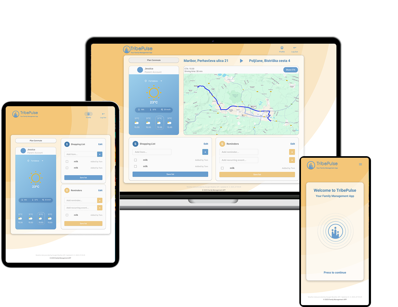
TribePulse
family management app
This redesign brings TribePulse’s mission into sharp focus: to simplify everyday family coordination through a clean, card-based interface. From the moment you land on the dashboard, you’re greeted with personalized weather at a glance, an interactive commute planner, and shared lists that encourage collaboration. By pairing generous white space with a warm color palette and a friendly family-silhouette logo, the new design feels both welcoming and intuitive to every member, parent or child, to jump right in.
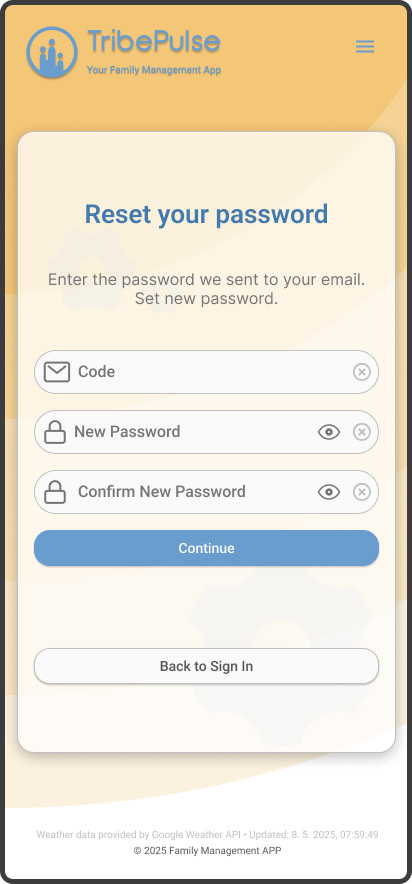
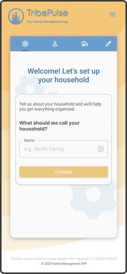
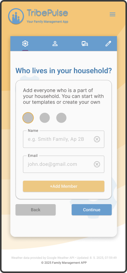
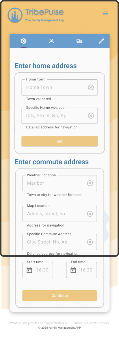
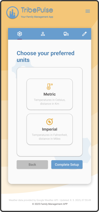
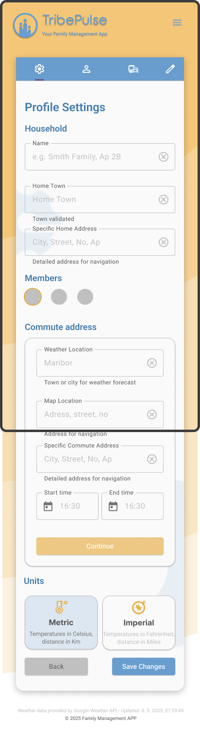
authentification & onboarding screens
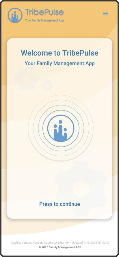
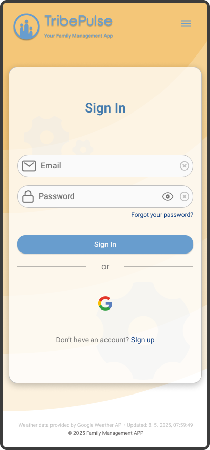
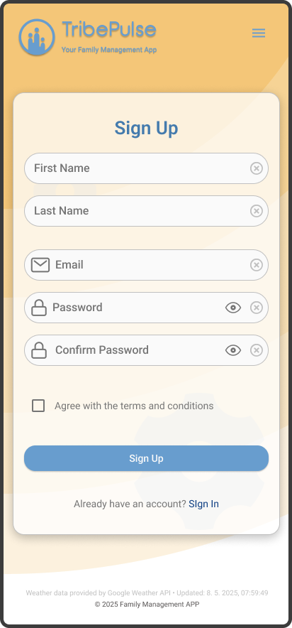
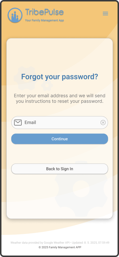
The TribePulse onboarding and authentication flow has been designed to feel intuitive, secure, and supportive, mirroring the app’s core values around family connection and simplicity. Each screen guides users through the process of setting up their household with clear visual hierarchy, soft color cues, and minimal friction. The interface adapts to a variety of user contexts, enabling smooth account creation, password recovery, and preference setup while maintaining a cohesive and welcoming brand tone throughout.
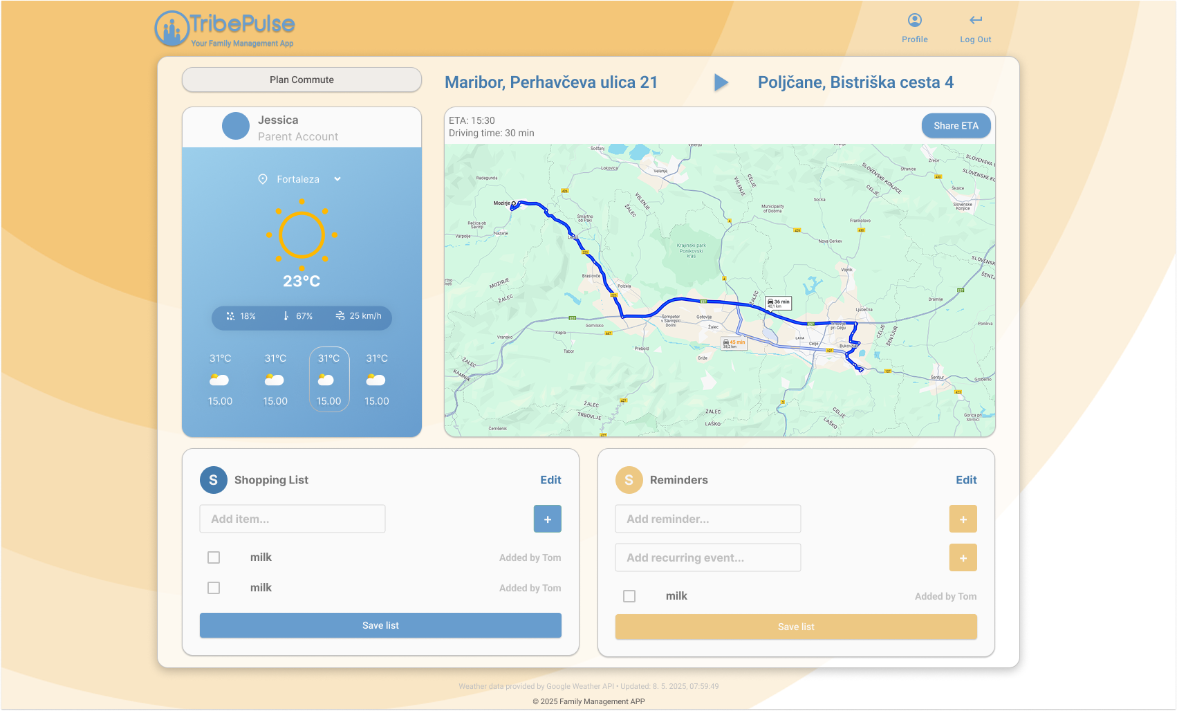
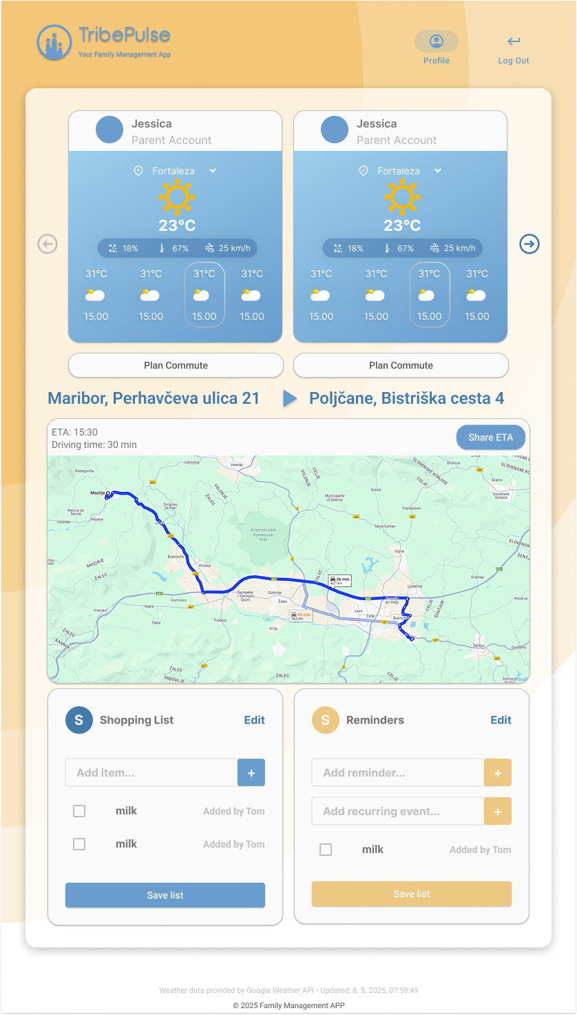
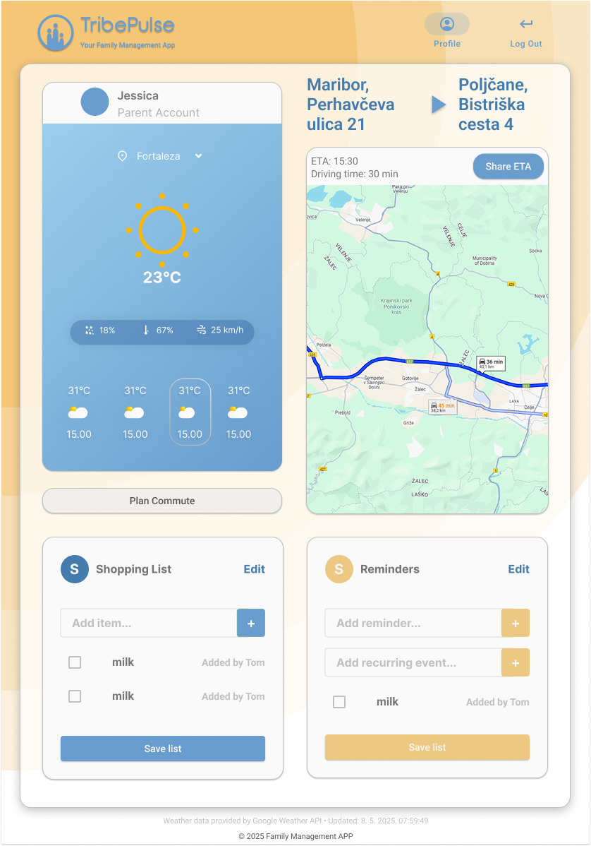
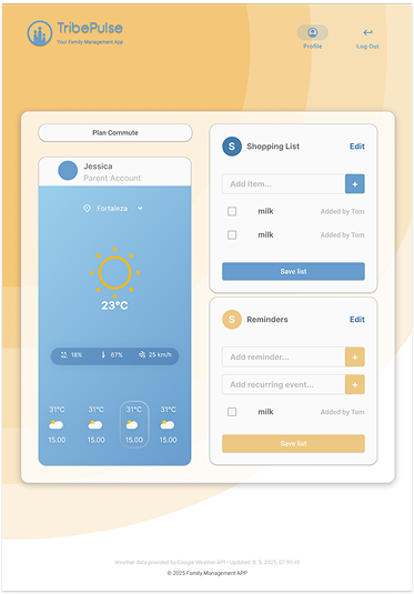
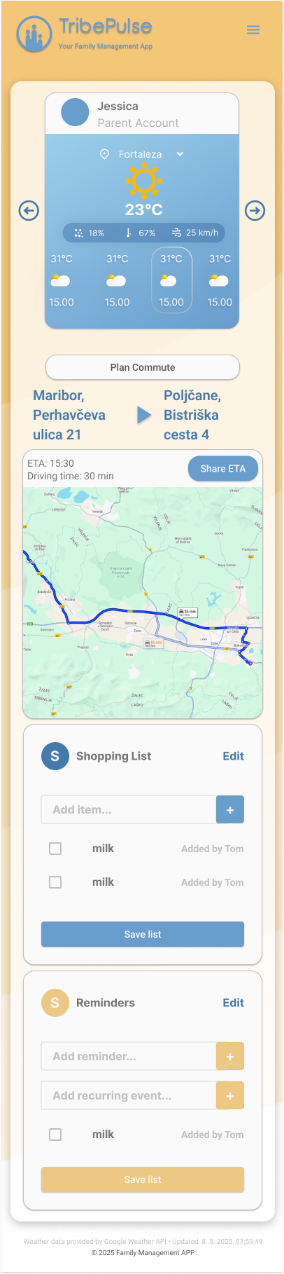
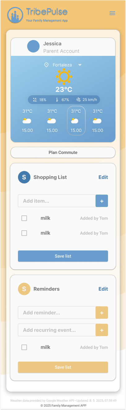
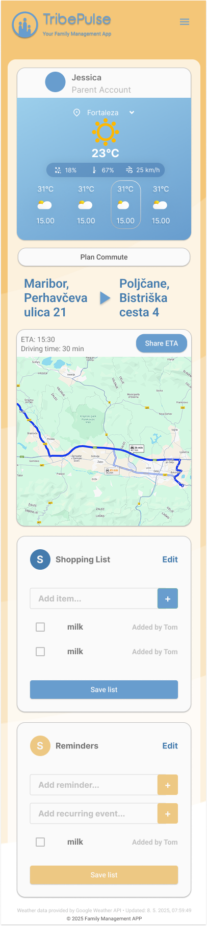
dashboard experience
The TribePulse dashboard delivers a streamlined, mobile-first experience that prioritizes clarity and everyday utility. Designed to adapt seamlessly across screen sizes, the interface presents essential tools such as weather, commute planning, shared shopping lists, and reminders in a structured, modular layout. Each element is visually distinct yet cohesive, supporting quick interactions while remaining accessible on both mobile and desktop. The design emphasizes real-time relevance and personalization, helping users stay organized with minimal effort, whether at home or on the go.